Zero supervision, total creative freedom, and 30€. We used all to design a festival identity out of destruction.
Team
This project started as a team of five. Sofia Parreira and I co-led it, appointed by ourselves, since we were the current coordinators of communications of AAC (AAC is the festival's main organizer). We picked João Castanheira and Nuno Pinto from our team at AAC, and brought in an external collaborator, Pedro Morais.
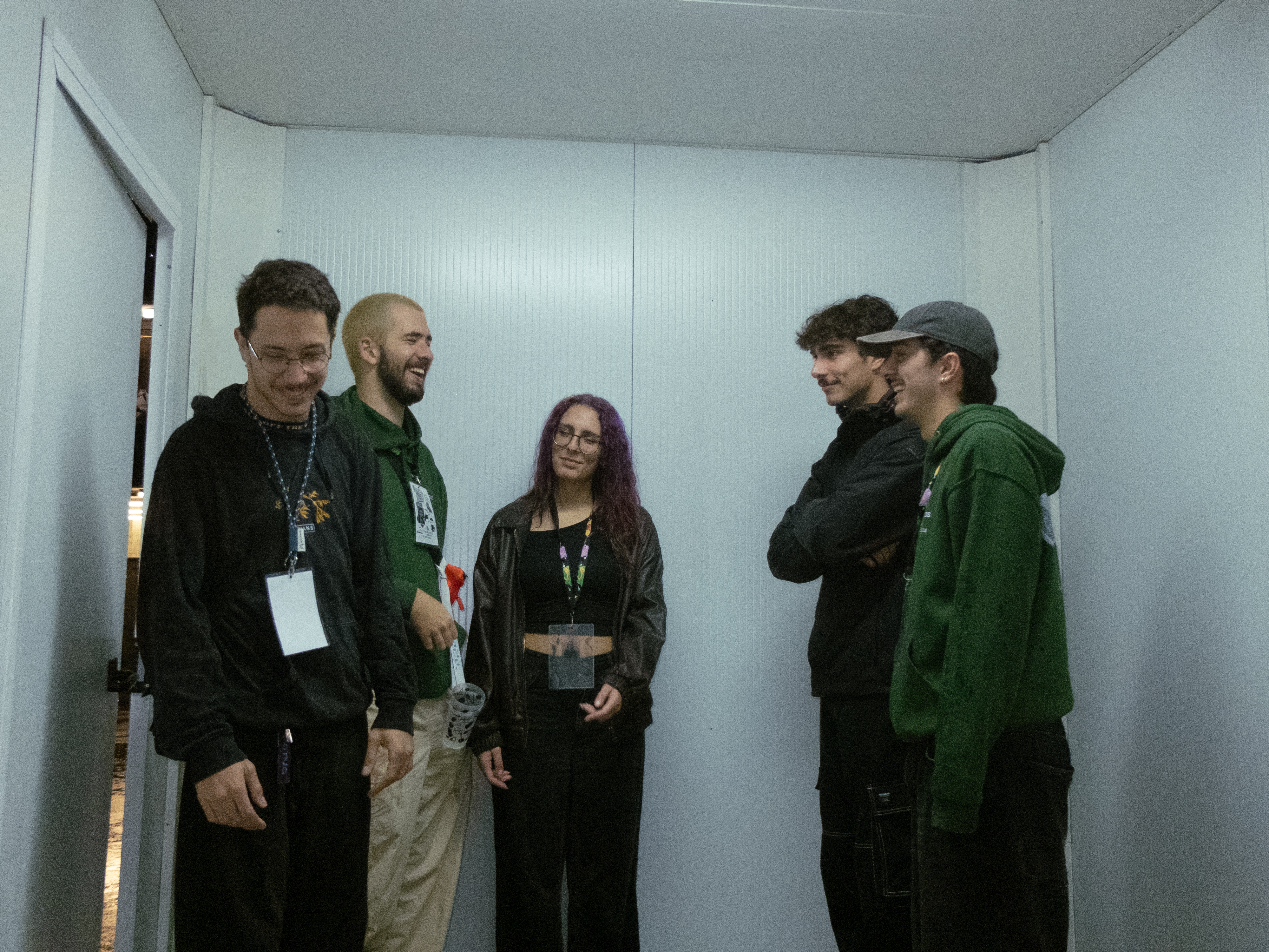
Beyond the visual identity and design, Sofia and I had one more job, defining the festival's communications: copy, tone, and all.
The Festa das Latas board technically had final say over our output. In practice, we had virtually no supervision. Zero change requests, minimal feedback.
Motivation
Like New Orleans' Mardi Gras, Brasil's Carnival or ancient Rome's Saturnalia, Festa das Latas is steeped in tradition. Similarly to these events, Festa das Latas relies on this history to justify its completely hedonic and gluttonous nature. Read those two sentences back to back and you might assume I'm building up to some moral judgment on carnival. I'm not.
Festa das Latas (chaotic as it is) is an important moment in Coimbra's civic life. For this slice of time, everyone silently agrees you're allowed to drop polite society and give in to your most basic impulses. Challenging you accept the unacceptable: that in the same body that lives our intellect, lives also, an equally perverse grotesque body.
Many Festa das Latas' goers describe it by omitting this nature shamefully, as they falsely understand that (conscientiously or not) hedonic celebration is the opposite to life in society. We wanted to represent it more honestly instead. An image as invested in its tradition as in its corporeal nature.
After all, the grotesque body deserves good design too.
Visual Identity
We started interested in the image a smashed can. It stands for the festival's best moment, the parade, where new students walk with cans roped to their ankles, destroying them step by step. Its image also represents this chaos and bodily wreckage we tried to achieve. One phrase that came up while we designed the identity was "É para partir tudo," roughly "let's fuck shit up." So we did. We leaned hard into destruction, building the identity around digital illustrations of broken objects. This phrase became our motto.
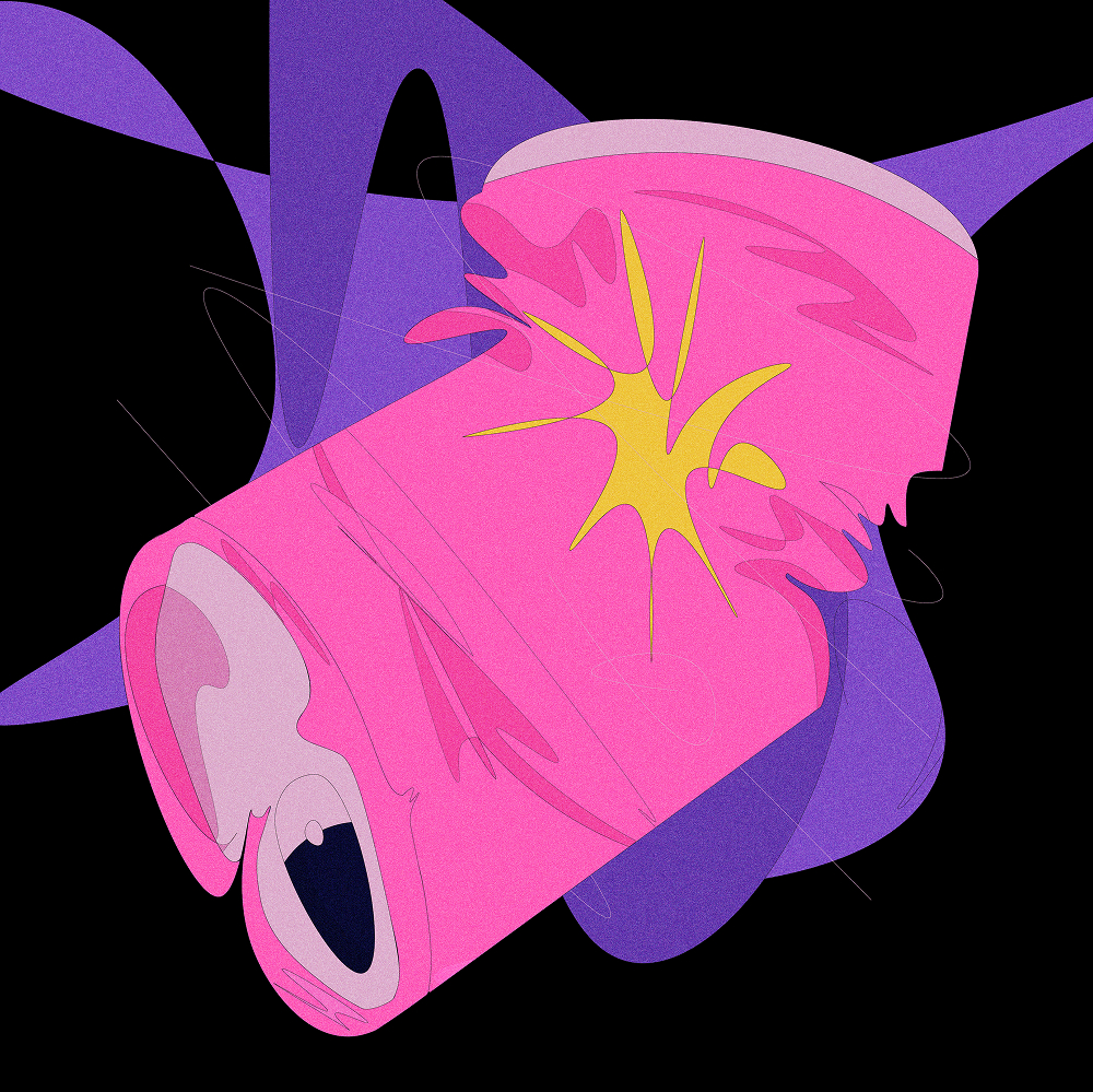
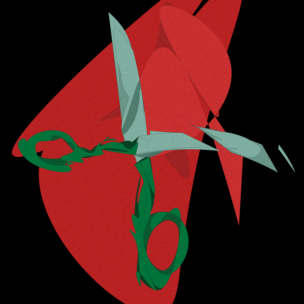
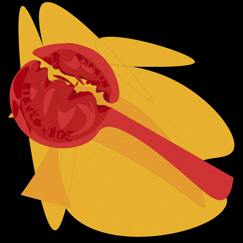
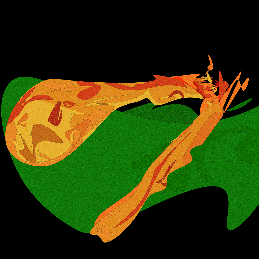
We paired these colorful illustrations (inspired by artwork of Sebastian Curi) with a clean serif and sans-serif font pairing (Hedvig) balancing the destructive theme. The color served a second purpose too, standing in opposition of older festival identities that stuck entirely to black and white.
Announcement Video
The first official made object was the announcement video. We spent the entire €30 budget printing the stickers used to make it.
Social Media
Most of the work went to Instagram. Announcing artists, selling tickets, sharing information. We went so deep into the game, we even built an Instagram filter on Meta Spark Studio. It stopped working after four months because Spark Studio was discontinued.
.jpg)
.jpg)
.jpg)
.jpg)
.jpg)
.jpg)
.jpg)
Merch & Billboards
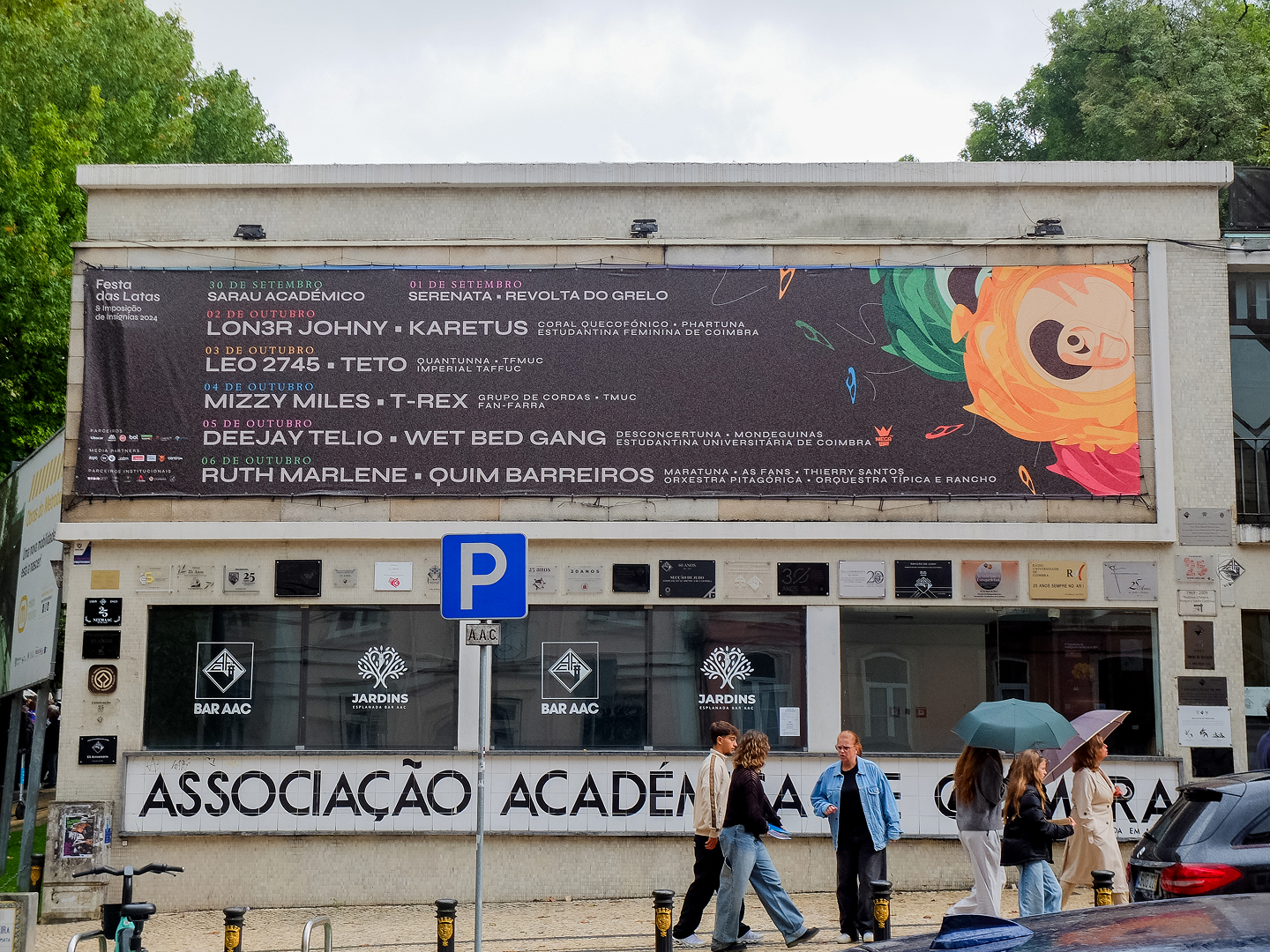
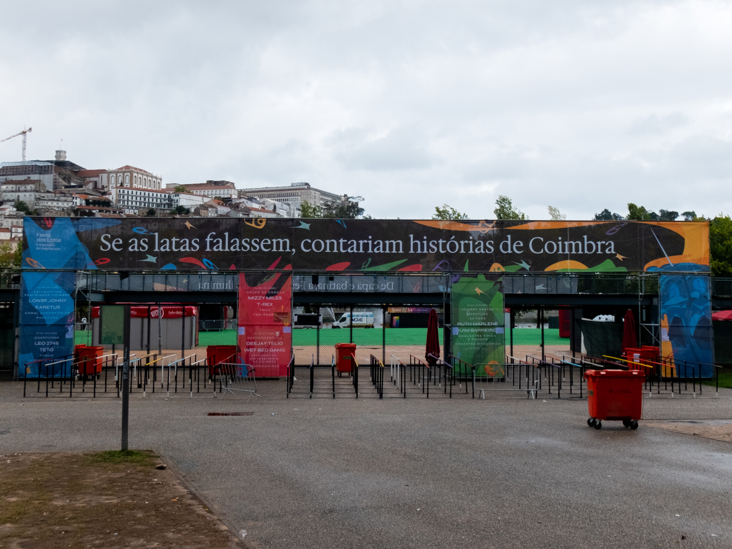
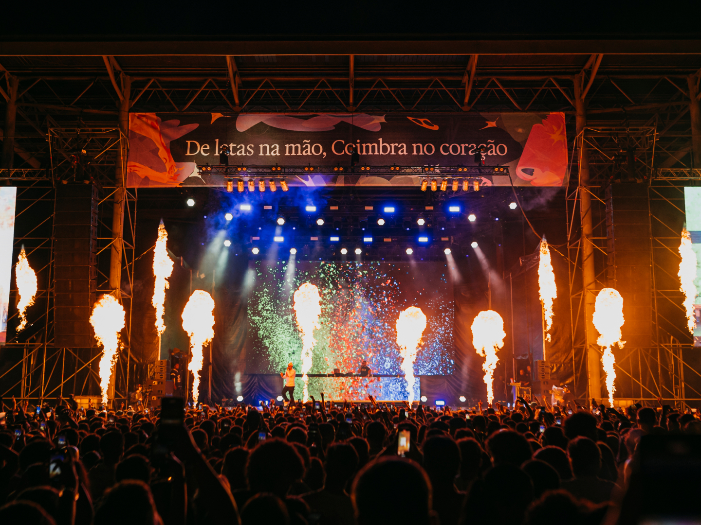
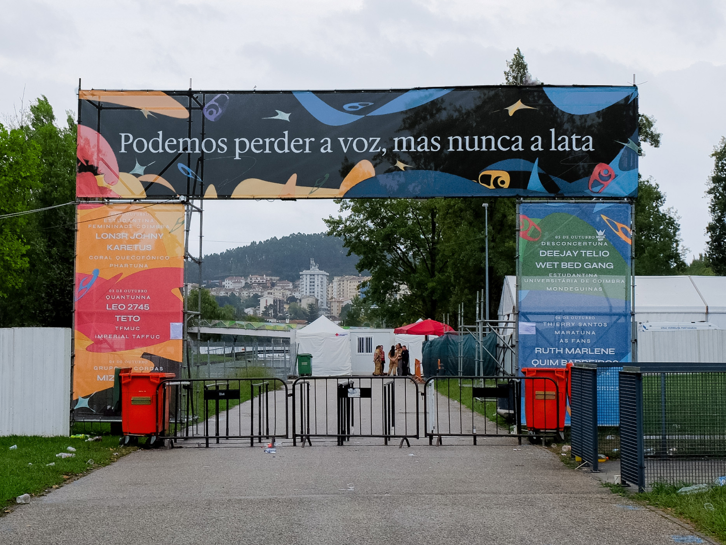
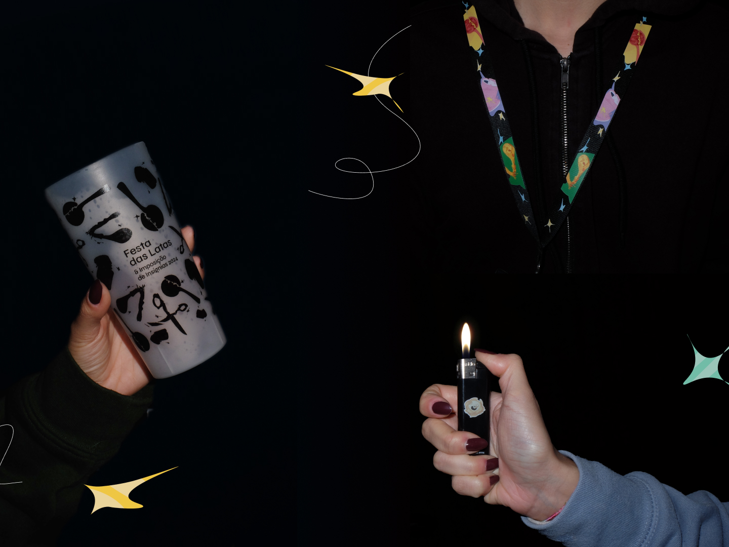
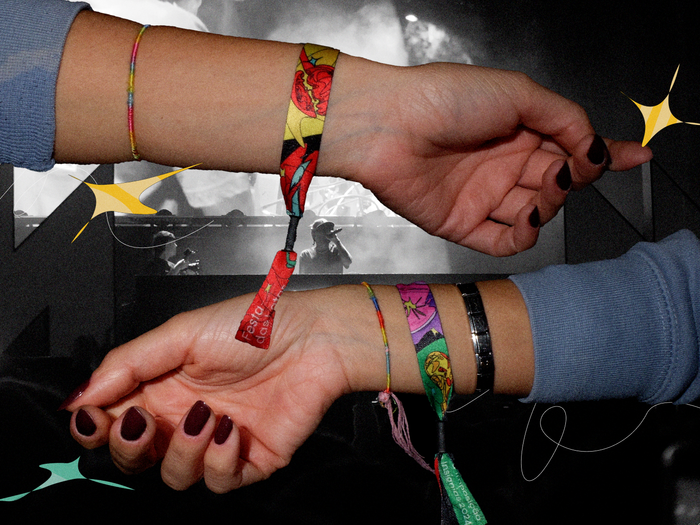
Making physical objects was the most rewarding part. We got to design huge billboards and see them up. The biggest capped at 30 metres (the stage one). It also provided our only let down, the merch team picked the base colors of the sweatshirts unilaterally, two pastel tones (blheck!).
Project in Review
Hand-drawn illustration and tight deadlines don't mix well. There might've been another unrealized visual identity, just as good, that cost less effort per object. Still, it's hard to imagine one as strong as this.
In retrospect, I think we made the best visual identity this festival has ever had. Partly due to our own work and how well we worked as a team, partly due to the context we were working in. It was the only year the design team also ran the festival's communications, which gave us more say over everything. Additionally, the directive board gave us total creative freedom.
In 2026, Festa das Latas decided to outsource design and communication work to a marketing company. You can see how that turned out.
░░░